The modern trend towards streaming services only has one major drawback (aside from subscription fees and that is finding devices/apps that are all compatible with one another. Mezzmo might be the universal hub solution for that problem and we’ll tell you why.
How to Download Mezzmo
You can download the program by clicking on the Download button located at the end of the review. If you like the software you should also consider buying the pro version.
The Program Review
While Apple enjoys their walled garden approach and Google’s services are more open-source, getting your Samsung television, HP computer, or whatever device you might have to work with your software is often a task.
This is especially true with older computers and “smart” television sets. Wouldn’t it be great if there was one single universal standard that controlled it all and made sure you got to see the content that you wanted, when you wanted, and on the device that you wanted?
Unfortunately, this is unlikely to happen. That’s why software like Mezzmo is invaluable if you want to coordinate media activities across a range of devices of differing ages and stages of deprecation.
Naturally, the software is only as good as the user experience it offers.
We’ll get to that in a bit, but, first, we’re going to tell you whether or not this app is worth your time.
We definitely think it is. To put it simply, this software is extremely powerful and does what it promises: Smoothes out the version differences and various roadblocks that software puts in the way of a user that is trying to stream something online.
It is easy to recommend because it is constantly updated and accommodates the most popular to the most obscure services and devices.
That said, it isn’t perfect.
There are a few things we would like to see changed but there’s nothing wrong with the core program.
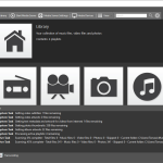
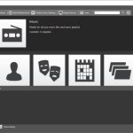
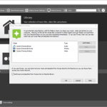
Like we mentioned above, the user interface really matters when it comes to software and Mezzmo is plagued by a 1990s trend that died out in software development but still lingers in the more powerful software like this app and that is extreme menus and small text.
Don’t get us wrong – we love having all of this functionality after a few clicks of the mouse.
But we can’t help but feel like a lot of this could have gone into embedded menus.
This would make navigation less of a search game and the presentation of fewer, not more, options actually lends itself to the user learning the software.
It’s just a thought. We get what is going on here but the sheer volume of information on the screen is dizzying when all you are trying to do is stream some media.
All of that leads to the second complaint, which isn’t really a complaint, and that is that it does take some time to learn this software and figure out what it wants from you as a user.
Whatever you’re trying to do is likely within Mezzmo’s capabilities, it’s just figuring out how to get there that is the challenge.
As with everything time related, the more practice will definitely help make perfect though we can’t help but think that this software would benefit from the simplification of its presentation – without losing any of its features – from the outset.

